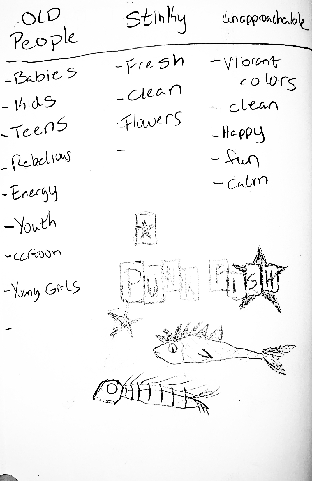
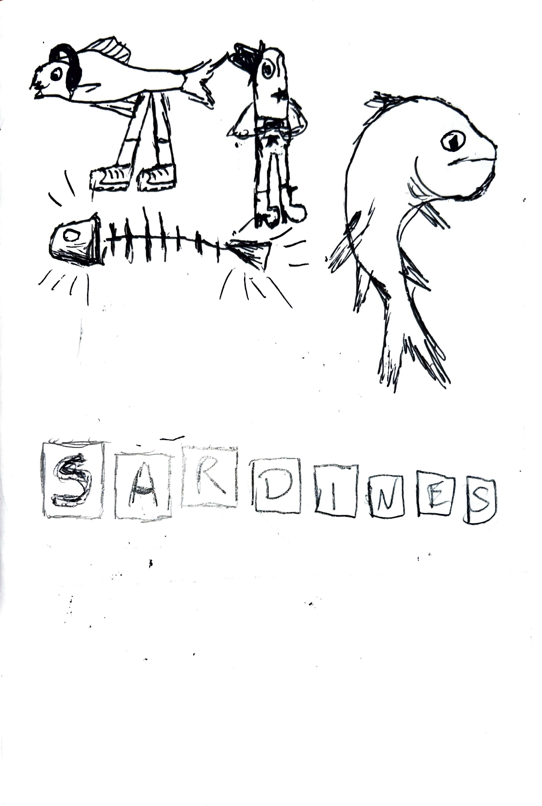
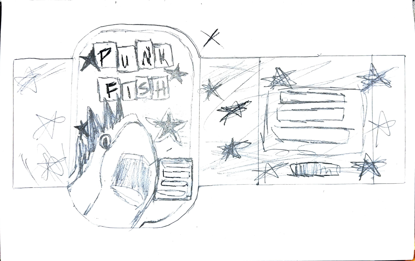
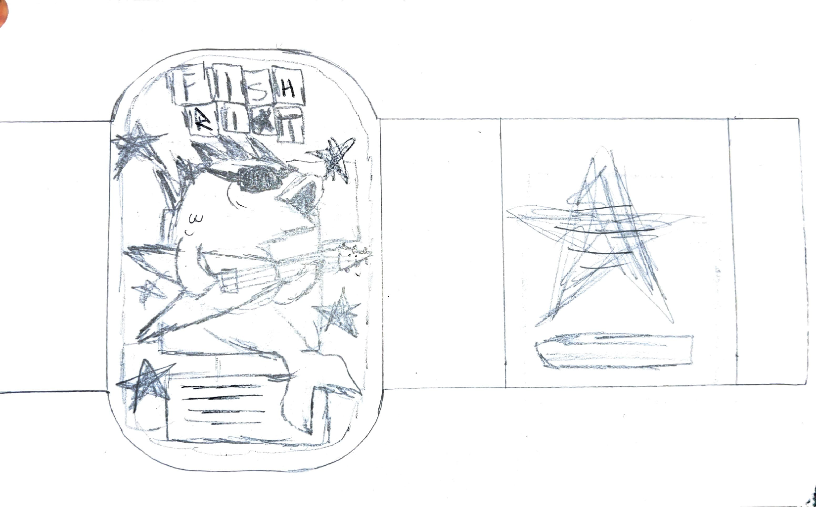
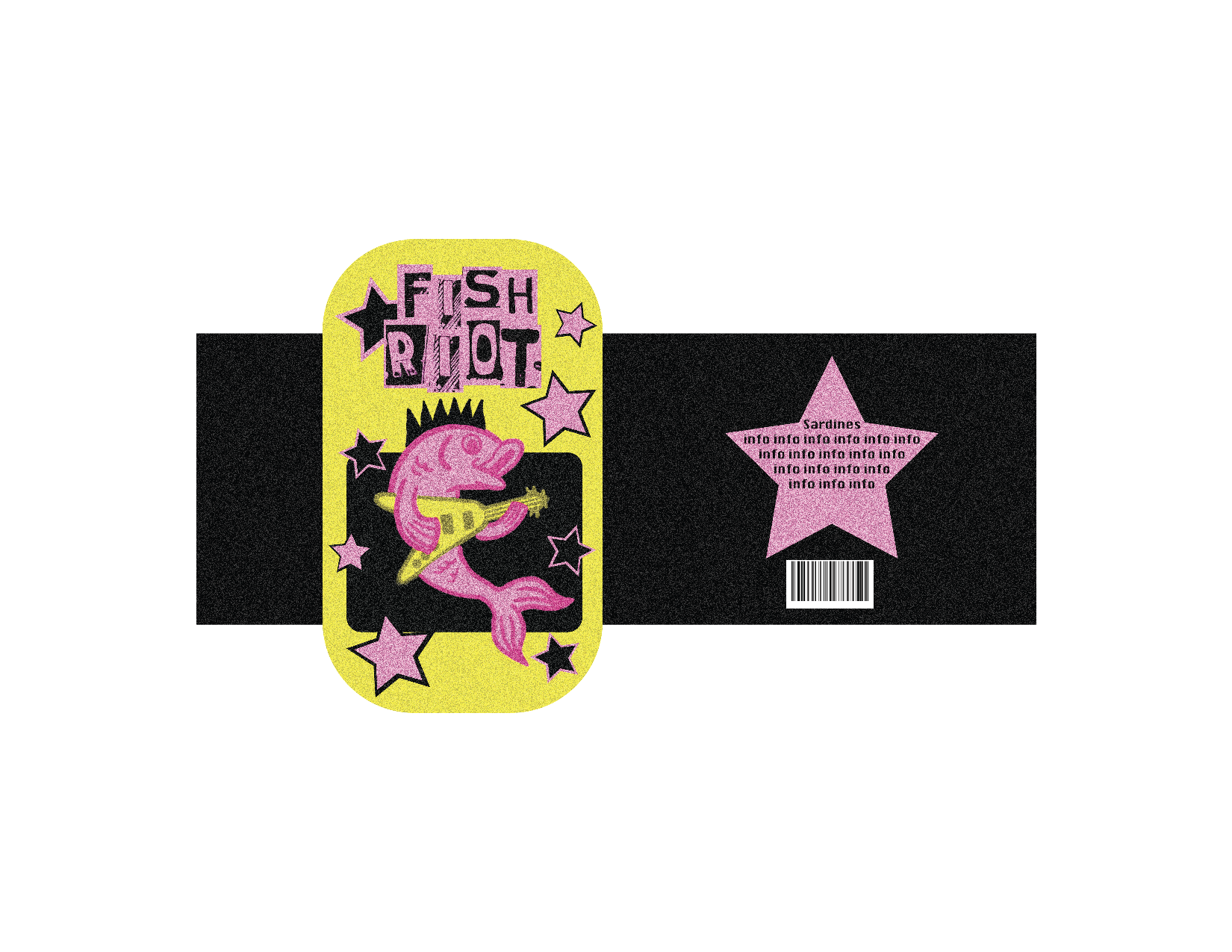
This sardine packaging design challenges the stereotype that sardines are outdated or unapproachable by reimagining them through a bold, youth-driven lens. Inspired by punk rock aesthetics, the design uses high-contrast colors like vibrant pink and yellow, layered textures, and expressive typography to create an energetic and rebellious visual identity. The playful illustration of a fish playing the guitar adds personality and humor, transforming the product into something fun, loud, and engaging.
Through this approach, the packaging shifts the perception of sardines from conventional to contemporary, appealing to a younger audience that values individuality and creativity. The combination of dynamic composition, collage-like elements, and striking visuals creates a design that stands out on the shelf while reinforcing a fresh, modern attitude toward an often-overlooked product.